How to Calculate Grade Curves Manually: A Step-by-Step Math & Excel Guide
Learn exactly how to calculate curved grades using Linear, Square Root, and Bell Curve methods. Includes formulas, Excel tutorials, and fairness comparisons.
Why Teachers Adjust Grades: The Math of Fairness
Grading on a curve is a mathematical adjustment used to normalize student performance against a specific standard or distribution. Teachers employ these adjustments not to artificially inflate grades, but to correct for variables outside the student's control, such as a disproportionately difficult exam or poorly phrased test questions.
When a raw class average falls significantly below the expected baseline (e.g., a 60% average on a standardized chemistry test), raw scores no longer accurately reflect student mastery. Curving realigns the data. It transforms the "Raw Score" (what the student earned) into a "Curved Score" (what the student deserves relative to the class), ensuring that a single difficult assessment does not disproportionately ruin a student's cumulative GPA.
(Curious how a curve changes your specific score? Check it now with our Grade Curve Calculator to see the difference instantly.)
Step-by-Step Guide: Calculating the Linear (Flat) Curve
The linear curve, often called the "Flat Scale" or "Top Score" method, is the simplest form of grade adjustment. It maintains the exact distance between students' scores while shifting the entire class distribution upward.
Scenario: The "Highest Score" Method
Imagine a history exam where the exam was harder than intended.
- Total Possible Points: 100
- Highest Score in Class: 88 (Student A)
- Class Average: 72
The teacher decides that the highest performing student (Student A) should rightfully receive a 100%. To achieve this, the teacher calculates the difference between the perfect score and the highest score.
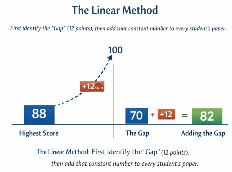
The Linear Method: First identify the "Gap" (12 points), then add that constant number to every student's paper.
Practice Problem: Adjusting a Class Average
To curve this class manually:
- Find the Difference: 100−88=12 points.
- Apply the Constant: Add 12 points to every single student's paper.
| Student | Raw Score | Calculation | Final Curved Grade |
|---|---|---|---|
| Student A | 88% | 88 + 12 | 100% (A) |
| Student B | 78% | 78 + 12 | 90% (A-) |
| Student C | 65% | 65 + 12 | 77% (C+) |
Common Pitfall: Why You Shouldn't Curve Above 100%
A strict linear curve can theoretically push grades above 100%. If a student received a 90% and the curve was +12 points, their new score would be 102%. Most academic departments require capping the final grade at 100% unless the syllabus explicitly allows for extra credit. When building a manual gradebook, you must set a "Max Value" rule to prevent this error.
Step-by-Step Guide: Calculating the Square Root Curve
The Square Root Curve, or "Texas Curve," is a non-linear adjustment commonly used in STEM courses. Unlike the linear method, which helps everyone equally, this method aggressively boosts lower scores while barely affecting higher scores.
The "Texas Curve" Logic Explained
The logic is defined by the formula:
GradeCurved = 10 × √GradeRaw
This formula exploits the mathematical property of square roots where the root of a decimal (or fraction < 1) is larger than the original number. By taking the square root of the raw score and multiplying by 10, you naturally compress the range of grades toward the top.
Manual Calculation Example (No Calculator)
Let's apply this to a failing grade of 49%.
- Identify Raw Score: 49.
- Find the Square Root: √49 = 7.
- Multiply by 10: 7 × 10 = 70.
The student moves from a 49 (F) to a 70 (C-). The curve added 21 points.
Compare this to a student with a high score of 81%.
- Identify Raw Score: 81.
- Find the Square Root: √81 = 9.
- Multiply by 10: 9 × 10 = 90.
The student moves from an 81 (B-) to a 90 (A-). The curve added only 9 points.
Calculating square roots for 30+ students can be slow. You can skip the manual math and use our Square Root Curve Calculator to process the whole class list automatically.
Comparison: Who Benefits Most from Square Roots?
This table demonstrates why the Texas Curve is preferred for preventing failure rates.
| Raw Score | Square Root | Curved Score | Points Gained |
|---|---|---|---|
| 36% (F) | 6 | 60% (D) | +24 Points |
| 64% (D) | 8 | 80% (B-) | +16 Points |
| 100% (A) | 10 | 100% (A) | +0 Points |
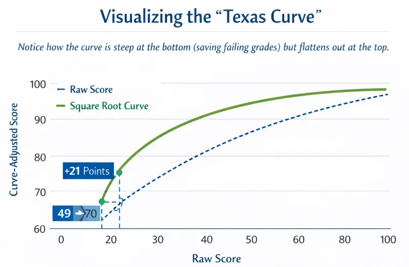
Visualizing the "Texas Curve": Notice how the curve is steep at the bottom (saving failing grades) but flattens out at the top.
Advanced Excel Tutorial: Building Your Own Gradebook
For teachers managing large classes, calculating curves manually is inefficient. You can automate this in Microsoft Excel or Google Sheets.
Setting Up Your Spreadsheet Columns
Organize your data with specific headers to prevent formula errors.
- Column A: Student Name
- Column B: Raw Score (Data Entry)
- Column C: Linear Curve (Formula)
- Column D: Texas Curve (Formula)
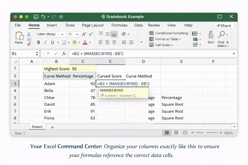
Your Excel Command Center: Organize your columns exactly like this to ensure your formulas reference the correct data cells.
Writing the IF Function for Linear Caps
To create a Linear Curve that automatically finds the highest score and caps the result at 100%, use this nested formula in Cell C2:
=IF(B2+(100-MAX(B:B))>100, 100, B2+(100-MAX(B:B)))
Breakdown of the formula:
- MAX(B:B): Finds the highest score in the entire class.
- 100-MAX(...): Calculates the point gap.
- IF(Result > 100, 100, ...): Checks if the new score exceeds 100. If yes, it displays 100; otherwise, it displays the curved score.
Using SQRT Formulas for Large Datasets
To apply the Texas Curve in Cell D2:
=SQRT(B2)*10
Note: Excel treats numbers as absolute values. If your grade book uses percentages (e.g., 85%), Excel sees "0.85". The formula requires whole numbers (85). If your cells are formatted as percentages, use this modified formula:
=SQRT(B2*100)/10
Visualizing the Bell Curve with Excel Charts
To see if your curve worked, select your new data column and insert a Histogram Chart. A successful curve should shift the "peak" of your histogram from the left (failing range) toward the center-right (passing range).
The Bell Curve: How to Force a Normal Distribution
The Bell Curve (Normal Distribution) is distinct because it is competitive. It does not look at the content mastered, but rather a student's rank compared to peers.
Calculating Mean and Standard Deviation by Hand
To use a Bell Curve, you must determine two statistics:
- Mean (μ): The average score. (Sum of all scores ÷ Number of students).
- Standard Deviation (σ): A measure of how "spread out" the scores are.
If a class has a Mean of 70 and a Standard Deviation of 10, grades are assigned by "Zones."
- A Grade: Score > 80 (Mean + 1σ)
- B Grade: Score between 70 and 80
- C Grade: Score between 60 and 70
- D/F Grade: Score < 60 (Mean - 1σ)
Assigning Z-Scores to Letter Grades
Universities often use Z-scores to assign these grades precisely.
Z-Score Formula:
If a student scores a 65 in the class above: Z = (65 - 70) ÷ 10 = -0.5. A Z-score of -0.5 places them slightly below average, typically resulting in a C.
Teacher's Dilemma: Which Method Should You Choose?
Selecting a curve method is as much about philosophy as it is about mathematics.
Not sure which method yields the fairest results? Run your scores through our Grade Curve Tool to compare the Linear vs. Square Root outcomes side-by-side.
When to Use Linear (History/English)
Use the Linear scale for humanities or subjective exams. If one student scored a 98%, it proves the test was valid and passable. The Linear curve respects the "validity" of the exam while acknowledging it might have been slightly too harsh for the majority.
When to Use Square Root (STEM)
Use the Square Root curve for objective, high-difficulty exams like Physics or Calculus. In these subjects, a raw score of 50% often indicates a substantial understanding of complex material. The Square Root curve acknowledges that "mastery" in STEM does not always require a near-perfect raw score.
Ethical Considerations of "Forced Failure"
Be cautious with the Bell Curve (Forced Distribution). It guarantees that a specific percentage of students will fail, even if the entire class performed reasonably well. It creates a "zero-sum game" where one student's success directly negatively impacts another student's grade.
Conclusion: Manual Math vs. Automated Tools
Understanding the math behind grading curves allows you to explain your policy transparently to students and parents. However, manual calculation is prone to human error, especially with large datasets or complex square root functions.
For a faster, error-free solution, you can use our automated Grade Curve Calculator to instantly process Linear, Square Root, and Percentage curves without building complex Excel sheets. If you need to verify how these adjustments impact a student's final transcript, verify the data with our Final Grade Calculator.